98.3
990
47.6
Deliverables
Creative Concepts
Evolved Data Visualization
This project was broken out into two phases, the first was an immediate need to incorporate new functionality into Profusa’s data visualization tracking platform. The second was to evolve the new functionality into a frictionless and modern user interface.
Lumee Sensor Values
Phase 1
Added Functionality
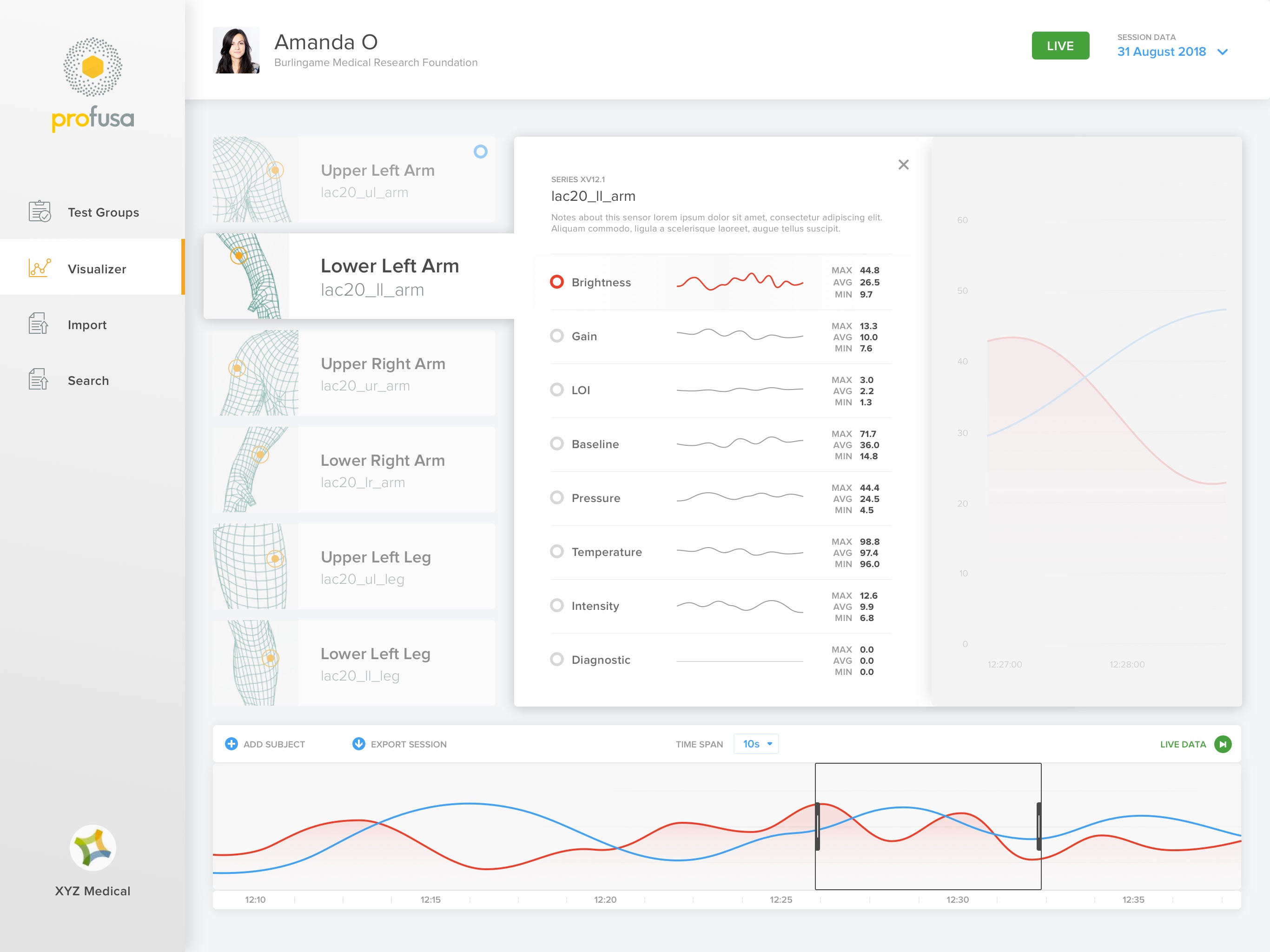
I was tasked with finding a solution that would allow researchers the ability to view all data sessions from a single test subject, and compare against other test subjects, all on one screen. The visualizer needed to function as a flexible timeline so that sessions from different timestamps could be adjusted for accurate comparisons.
With this added functionality came the need for an expanded search experience. This would make it easier for researchers to pinpoint different data types, across multiple sessions from any test subject.
Phase 2
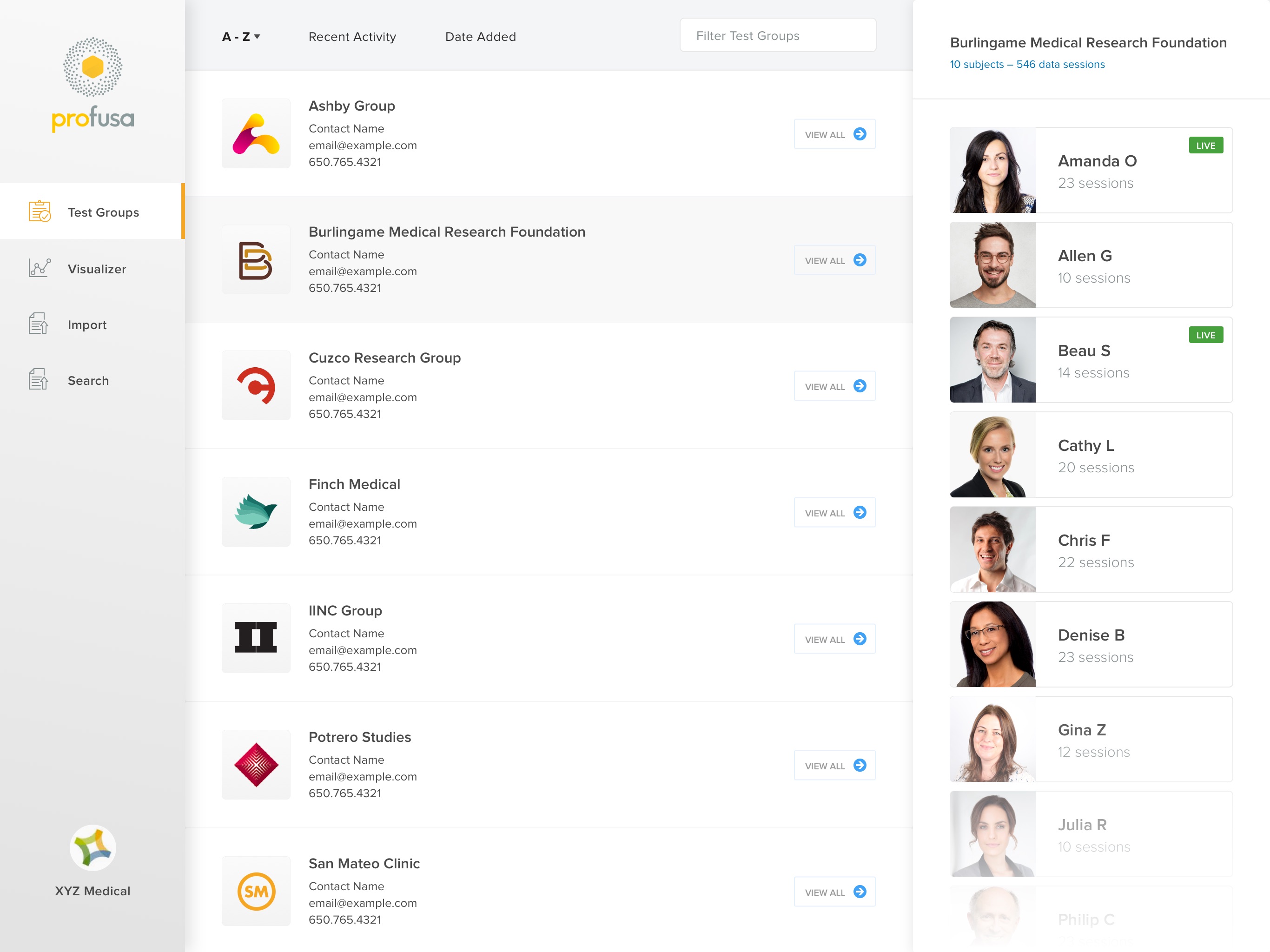
User Interface
In order to market their evolving product, I was tasked with creating a concept for a better, more stream-lined experience. Using their current brand colors, I set out to create a modern dashboard to compliment the technology. The end result is a much simpler user experience with floating cards and layered interactions to create a sense of depth within the workspace.


